Your announcement looks good in the editor. Now hide its images. Can someone still tell what changed, who can use it, and where to go next?
Email accessibility starts with those practical questions. A reader might enlarge the text, navigate links with a keyboard, or listen with a screen reader. The message needs to keep its meaning through those different ways of reading.
Use these ten checks on a real campaign, then test the delivered message in the mail apps your readers use. This is a pre-send review, not a complete conformance audit. The Email Markup Consortium’s 2026 accessibility report documents both email-client limitations and issues that automated checks cannot judge, such as whether alt text fits its context.
1. State the purpose in plain language
Read the subject, opening sentence and main link together. They should tell someone why the email matters and what they can do.
For a fictional reporting product called Clearboard, replace “Something big has landed” with “Save the reports you run every week.” Explain what saving does before asking someone to try it. Spell out unfamiliar abbreviations and keep instructions in the order the reader will follow them.
Check the real message after personalization too. A missing first name should not leave an unfinished greeting or an unclear subject.
2. Keep essential information out of images
The offer, availability, deadline and next step belong in ordinary text. A screenshot can help someone recognize a control, but the instructions should also work without it.
An image containing the entire announcement leaves someone dependent on that image loading and on its text being readable at their preferred size. Keep the main link as text too, even when you style it as a button.
A useful pass condition is simple: with images blocked, the reader can still understand the announcement and reach the intended destination.
3. Choose alt text for the image’s job
Ask what someone would miss if they could not see each image. Describe that information, rather than the file name or every visual detail.
For a screenshot that identifies a control, “Save report is above the report’s filters” is more useful than “Screenshot of dashboard.” If the surrounding paragraph already explains the same thing and the image adds only decoration, an empty HTML alternative, alt="", can avoid repetition. A linked image with no other link text needs an alternative that explains its destination or action.
The W3C image decision tree distinguishes informative, decorative and functional images. If your editor cannot express an appropriate alternative, simplify the design or remove the nonessential image.
In Rowsend, an Image block has an alt-text field. The editor’s checks warn about missing alt text. Read the wording yourself too: a filled field can still be unhelpful.
4. Use headings to describe the structure
A large, bold paragraph can look like a heading without acting as one for assistive technology. Use your editor’s heading controls, or semantic HTML headings in a custom design.
For a short announcement, one main heading and a few paragraphs may be enough. For a newsletter, use section headings that describe each item, and keep their levels in a logical order. Do not choose a heading level just to get a smaller font.
The W3C headings tutorial explains how headings communicate organization. In Rowsend’s block editor, choose Heading 1, 2 or 3 rather than enlarging a text paragraph.
5. Make links understandable when read separately
Replace repeated “Click here” and “Read more” links with labels such as “Save your first report” or “Read the saved reports guide.” Someone reviewing a list of links should be able to distinguish them.
Make the visible wording carry the meaning. Do not rely on hover text or a hidden label to rescue a vague button. The W3C link-purpose guidance explains why meaningful link text helps people choose where to go.
Follow the main link in the test email. Check that it reaches the promised task, including after signing in. Review the unsubscribe and preference links for clear wording too.
6. Measure contrast, including the footer
Check the actual text and background colors together. Include button labels, secondary copy and footer links. Pale gray can look subtle in the editor and become hard to read in the inbox.
Use WCAG’s text-contrast guidance as a reference: ordinary text needs at least 4.5:1 contrast, while qualifying large text needs 3:1. A contrast checker can calculate the ratio. For a simple campaign rule, aim for 4.5:1 across the copy instead of relying on the large-text exception.
Add words to color-coded information. “Available on Pro” communicates something a green dot alone cannot. Also inspect the delivered message in dark mode, where a client may change your colors.
7. Check the order someone hears
Read the content from beginning to end without using its visual position to fill gaps. A two-column design might display a heading next to its explanation while exposing them in a different order to a screen reader.
A single-column layout makes the intended sequence easier to maintain. If you use a custom HTML design with tables for layout, keep the source order logical and mark layout tables with role="presentation". Actual data tables need their table structure and headers instead.
The Section508.gov email checklist is a useful reference for message structure. Verify the reading order in the delivered email, especially after changing a template.
8. Enlarge the text and try the links on a phone
Start with body copy around 16 pixels, then test it. That is a practical design starting point, not proof that the email is accessible.
Enlarge the message or use the mail app’s text-size controls. Check that the headline, button and footer remain readable without overlapping or cutting off. On a phone, make sure links have enough space around them to select the intended one.
If the design only works at one fixed width, simplify it. A screenshot should not require zooming to discover an instruction that could have been a sentence in the body.
9. Review language and the text alternative
For a custom HTML template, declare the message’s actual language, such as <html lang="en"> for English. The W3C language guidance explains how this helps assistive technology choose pronunciation rules. Check the delivered result because mail apps can change the markup they receive.
Read the plain-text alternative as its own message. It should preserve the purpose, instructions and usable destination URLs. In Rowsend’s HTML mode, Plain-text version lets you supply it; leaving it empty generates one from the HTML. Inspect generated text too.
A text alternative gives recipients another way to read. The HTML version still needs its own checks.
10. Test the delivered message with assistive technology
Send the final version through your sending provider. The editor’s preview cannot show every change a mail app makes.
Use a small test record to capture what you actually checked:
- Name the mail app, device and screen reader, such as Apple Mail on macOS with VoiceOver. Add the combinations your audience or organization requires.
- With images blocked, confirm the announcement and next step remain understandable.
- Use keyboard navigation to reach the message’s links. Check their names, order and visible focus where the client exposes it.
- Listen to the body and navigate by headings and links where supported. Look for repeated descriptions, unexpected table announcements and content read out of order.
- Inspect enlarged text and dark mode. Record any clipped content or unreadable labels, then repeat the affected checks after fixing them.
Learn the screen reader’s basic reading and navigation commands before relying on a quick test. For campaigns your organization depends on, include someone experienced with the assistive technology in the review.
Rowsend’s Send test sends through your configured provider. Use that message for the inbox checks rather than treating the Desktop and Phone previews as the final result.
Before and after: a product announcement
Suppose Clearboard is announcing saved reports to customers who already build reports. This is a fictional example, not a screenshot of Rowsend.
The first version uses an image for its heading and all its instructions. Beneath it, a pale button says “Click here.” Its image alternative says only “New feature.” When images are blocked, almost everything the reader needs disappears.
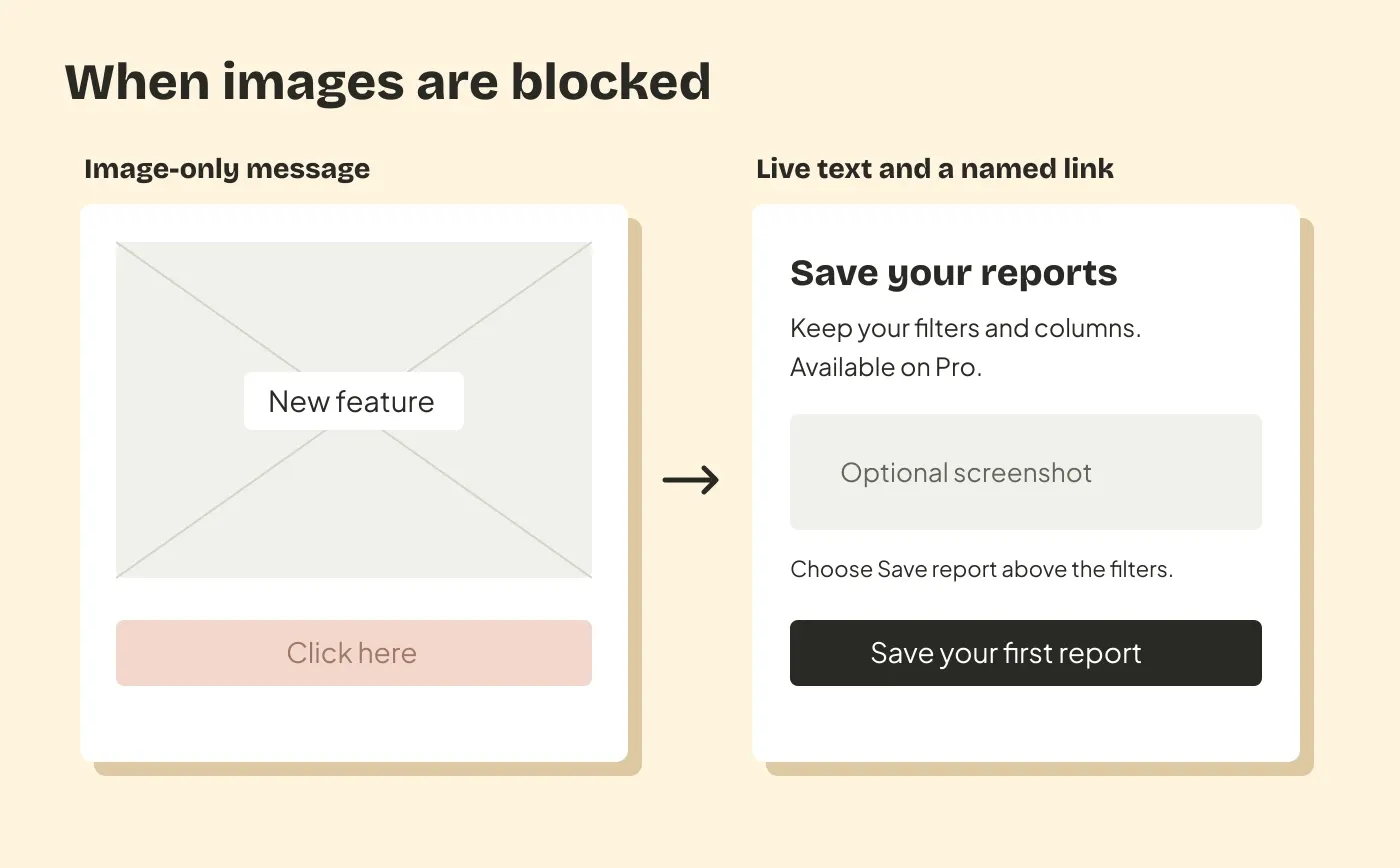
Rewrite the message as text:
Subject: Save the reports you run every week
Preview: Keep your filters and columns for next time. Available on Pro.
Save a report for next Monday
You can now save a report’s filters and columns, then open it again without setting everything up.
Open a report you use regularly and choose Save report above its filters. Give it a name so you can find it next time.
Available on the Pro plan.
Save your first report
Make the body title a real heading. Link the final action to the report list, style it with sufficient contrast, and keep the footer readable. Add a screenshot only if it helps someone find the control; the instructions already stand on their own.
For the audience and message behind this example, see A product update email people can act on.
Keep a test record with the template
Record the template version, test date, client and device, assistive technology, problems found and fixes made. Note what you have not tested. Recheck the affected parts when you change the layout, images, brand colors or footer.
Rowsend’s campaign editor provides text, headings, image descriptions and test sends for campaigns to contacts from your own database. Its missing-alt warning is one check in this process. Before sending, confirm that a reader can understand the message and use its main link in the delivered version you tested.